
- woodworking
- photography
- white balance
- colour accuracy
- calibration
Wood Tone Photography: A White Balance Test
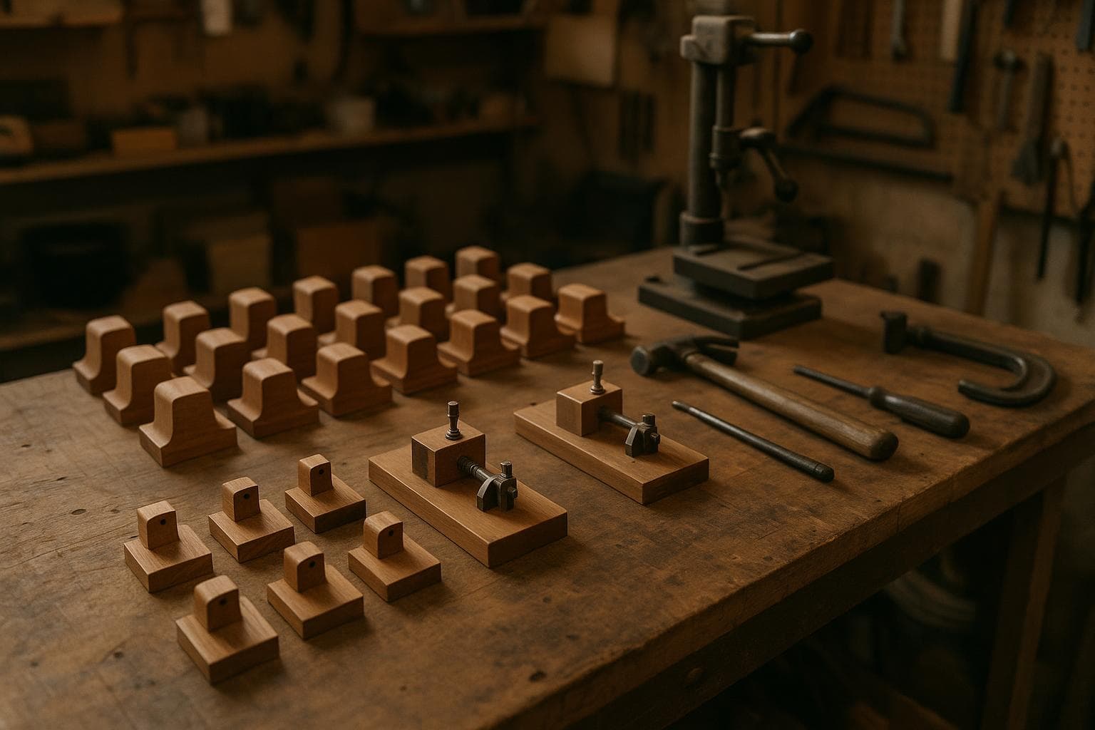
Wood colour is the mismatch people complain about most because it changes at every stage: the timber varies, the finish reflects light, the camera interprets colour, and the buyer views the result on a different screen. The short answer is to control the light first, set white balance against a grey reference card, and calibrate the screen before judging the file.
Why wood tone photography goes wrong
A painted object can be close to one flat colour. Wood cannot. Even two boards from the same species can differ in grain, density, earlywood, latewood, and finish absorption. A clear coat may make a brown look deeper, while an oil or stain can shift the perceived hue according to the light falling on it.
The photograph also records the light source, not just the material. Daylight changes with weather, time, window direction, and nearby surfaces. Indoor lamps often have a different colour temperature. A camera's automatic white balance tries to find a plausible neutral point, but it does not know whether a warm board is meant to look warm or has been lit by a warm bulb.
Set up a repeatable colour test
Use the same camera, lens, surface, background, and light position you expect to use for finished photographs. Do not begin with a decorative scene. Start with a plain test frame containing:
- the actual wood and finish you need to photograph
- a neutral grey reference card placed in the same light as the wood
- a small white object and a black object, both matte if possible
- a note showing the camera settings and light arrangement
A grey reference card in a test frame gives the editing software a known neutral to correct against. It is not there to make the wood grey. It provides a point that should have equal red, green, and blue values after correction, allowing the rest of the image to be adjusted from a known reference.
Keep the card out of direct glare. A glossy card can reflect the light source and produce a false reading. Fill enough of the frame with the card for the camera or editor to sample it accurately, but do not let it cover the wood area you need to inspect.
Set the camera to a fixed white balance rather than Auto White Balance for the comparison shots. If the camera records RAW files, white balance can be changed later with less damage, but a fixed setting still makes a test series easier to compare. If you use JPEG, the selected white balance is more consequential because the correction is partly baked into the file.
Take one frame with the grey card visible, then remove the card without moving the camera, material, or light. Photograph the wood at the same exposure. Repeat this whenever the light arrangement changes.
Test the light before correcting the colour
First test the lighting with only one kind of source operating. Close the window covering or switch off indoor lights so that daylight is not mixed with lamps. Then reverse the test if both sources might be used in practice.
Mixing daylight from a window with a warm indoor bulb gives two different colour temperatures in one frame, which no single white balance setting can correct. One side of the wood may look blue while the side nearest the bulb looks yellow or orange. A grey card placed in one part of that frame can correct the light at its location, but it cannot make the other colour temperature match across the whole image.
For a small work area, the cheap solution is usually the right one: use one consistent light source, block the window, and repeat the setup. Do not buy a second lamp, a colour meter, or a more elaborate lighting system to solve a mixed-light problem that a curtain or switch can remove.
If the piece is too large for one source, place the lights so their colour temperature matches and check the result with the grey card at several positions. Matching specifications do not guarantee identical output, especially across different lamp types or ageing lamps. The card test decides whether the arrangement is usable.
Read the first result
| Test stage | Measurement or condition | Good result | Bad result | One adjustment |
|---|---|---|---|---|
| Light uniformity | Grey card photographed near each edge of the wood | The card stays visually neutral and similar in brightness across the frame | One area is warmer, cooler, or darker than another | Move, diffuse, or remove the light causing the change |
| White balance | Grey card correction applied to the test frame | The card becomes neutral without making the wood look unnaturally grey | The card is neutral but the wood still changes colour across the frame | Eliminate mixed colour temperatures before changing white balance |
| Exposure | White and black reference objects remain distinguishable | White retains surface detail and black retains shadow detail | White is clipped or black is crushed | Reduce or increase exposure, then retake the reference frame |
| Wood patch | Compare the corrected file with the physical piece under the test light | Hue, brightness, and finish sheen agree at normal viewing size | Hue is close but brightness or sheen is wrong | Adjust exposure or light angle, not saturation first |
| Display check | View the file on a calibrated screen and a second ordinary screen | The calibrated view is the reference and the second view is acceptably close | Both screens disagree strongly, or neither resembles the sample | Calibrate the main screen before editing the file further |
What each failure points at
A warm or cool entire frame usually points to white balance. Rephotograph with the grey card in place, sample the neutral card in the editor, and apply that correction to the matching wood frame. Do not use saturation to compensate for a neutral balance error. Saturation changes the intensity of the wrong relationship and can make the grain look false.
A frame with blue shadows and orange highlights points to mixed light. White balance is not the fix. Turn off one source, block the window, or replace the lamp so the scene has one colour temperature. If a second light is necessary, match the sources and test the card at the edges of the subject.
A frame that looks correct in one corner but changes across the board points to uneven illumination or a reflective finish. Move the light farther away, enlarge the diffuser, or change the angle so the reflection does not strike the lens. A finish can be the correct colour while still looking too bright because of a specular reflection.
A frame where the white object has no surface detail points to overexposure. Pulling highlights down in editing may recover some RAW data, but a clipped JPEG area cannot be reconstructed reliably. Lower exposure and repeat the shot.
A frame where the wood hue looks plausible but the whole piece is too dark points to exposure, not white balance. Compare the midtone area of the physical sample with the screen and adjust exposure in small steps. Keep the white reference from clipping as you do this.
If the file looks different on two screens, stop editing the wood. Screen calibration is now the suspect. A hardware colorimeter is the dependable method for a screen used for colour-critical work, but it is against our interest to recommend one for every maker: if photographs are viewed mainly on a modern, reasonably consistent screen and the problem is an orange cast caused by a lamp, a grey card and controlled light are enough. The upgrade fixes a problem you may not have.
For a screen that does need calibration, set its intended colour space and brightness according to the display and your working software, then calibrate it with the screen warmed up and the room lighting in its normal state. Avoid judging colour under a bright window during the day and a dim lamp at night. Your eyes adapt to the room, which makes an uncalibrated screen seem more trustworthy than it is.
Build a small reference library
Photograph a set of common wood samples under the same controlled arrangement. Include unfinished, clear-coated, and coloured surfaces if those are part of your work. Keep the original reference files, the corrected versions, and a note of the light source, camera white balance, exposure, and distance.
This library is more useful than a generic colour chart because it shows how your actual finishes behave. It also exposes changes in the setup. If a new lamp makes the same sample require a different correction, the lighting has changed even if the lamp is labelled with a familiar colour temperature.
Use the reference library as a check, not as a substitute for the grey card. The grey card establishes neutrality for the current frame. The wood samples show whether the setup remains repeatable over time.
Keep the final image correction restrained. A small white-balance adjustment followed by exposure and highlight control is usually easier to defend than a strong saturation or hue shift. If the corrected photo still disagrees with the physical sample, return to the light and the screen before editing individual colour channels.
Frequently asked questions
Should I use Auto White Balance for wood photos?
Use a fixed white balance for a repeatable series. Auto White Balance can change between frames as the amount of wood, background, and reflected light changes. RAW capture gives you more freedom later, but it does not remove the need for consistent light.
Can a grey card fix sunlight and a warm lamp in the same photo?
No. It can provide a neutral correction for the light reaching the card, but mixed daylight and warm indoor light create different colour temperatures in different parts of the frame. Use one source, or match the sources and verify the card at several positions.
Do I need a colourimeter to get colour accuracy photos?
Not as the first step. A grey card, fixed white balance, controlled lighting, and sensible exposure solve the common errors. Buy or borrow a colourimeter only after those checks show that the screen itself is preventing reliable decisions.
The Boss Factory builds made-to-order work through Custom Woodworking and Design & Product Development, with requests submitted at /quote.
Related services
All services →
Have a project in mind?
Tell us what you want built — we reply within 24–48 hours.